Exworks Rebrand
Overview
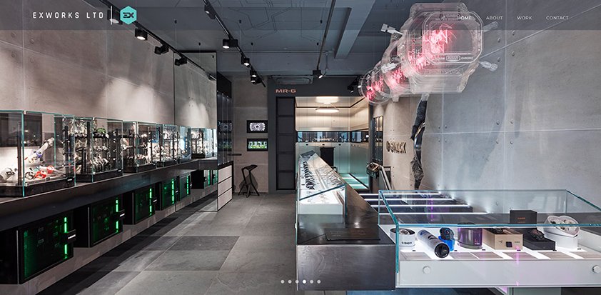
A rebrand of the Exworks visual identity including a new logo and website design.
I set about trying to create a branding which better encompasses the company’s services. The old branding failed in this respect. I wanted to represent both the design and manufacture side of the business and provide a logo that would work well with colour, as a single colour and with imagery.
A hexagon shone through as the right visual language. It is the shape of an isometric cube, which is indicative of both design and manufacture. A bold typeface shows a solidity which again felt right for the product Exworks offers.
The large area afforded by the hexagon icon gives the logo a flexibility to be used with imagery creatively.
Design
Branding
Graphics
Web
Client
Exworks Ltd
2017/18


